


Largest Norwegian fuel supplier refuses U.S. warships over Ukraine
Norwegian fuel company Haltbakk Bunkers has announced it will cease supplying fuel to U.S. military forces in Norway and American ships docking in Norwegian ports, citing dissatisfaction with recent U.S. policy towards Ukraine.
In a strongly worded statement, the company criticised a televised event involving U.S. President Donald Trump and Vice President J.D. Vance, referring to it as the “biggest shitshow ever presented live on TV.” Haltbakk Bunkers praised Ukrainian President Volodymyr Zelensky for his restraint, accusing the U.S. of “putting on a backstabbing TV show” and declaring that the spectacle “made us sick.”
As a result, the company stated: “We have decided to immediately STOP as fuel provider to American forces in Norway and their ships calling Norwegian ports. No Fuel to Americans!” Haltbakk Bunkers also urged Norwegians and Europeans to follow their lead, concluding their statement with the slogan “Slava Ukraina” in support of Ukraine.
#Norwegian #Ukraine #UKDefenceJournal
Read More...
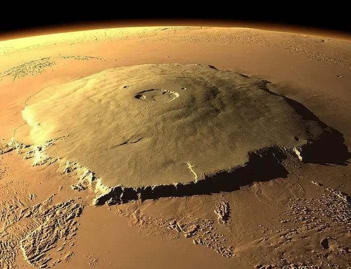
The tallest mountain in the solar system, Olympus Mons on Mars. It has a height of 25 km, Mount Everest is 'only' 8.8 km tall.
💫Welcome💫
Checkout Our YouTube Channel & Do Subscribe
Read More...


‘He defended our honour’: Ukraine reacts to Zelenskyy’s clash with Trump
Back home there was widespread support for Ukraine’s president, but also dismay at his car-crash encounter in the Oval Office
Ukrainians have rallied behind Volodymyr Zelenskyy after his mauling on Friday in the White House, and have accused Donald Trump and the US vice-president, JD Vance, of deliberately and cynically “starting a brawl”.
There was widespread support for Ukraine’s president at home and dismay at his car-crash encounter in the Oval Office. There was also praise for Zelenskyy’s insistence that a peace deal without security guarantees was meaningless, and that Russia could not be trusted.
The bitter fallout continued on Saturday. There were reports that Trump – who claimed Zelenskyy had “disrespected” him and was “not ready for peace” – was planning to cut off all military supplies to Ukraine.
Senior Ukrainian officials said that without meaningful security pledges any ceasefire deal with Moscow would not last.
#Ukraine #Zelensky
Read More...

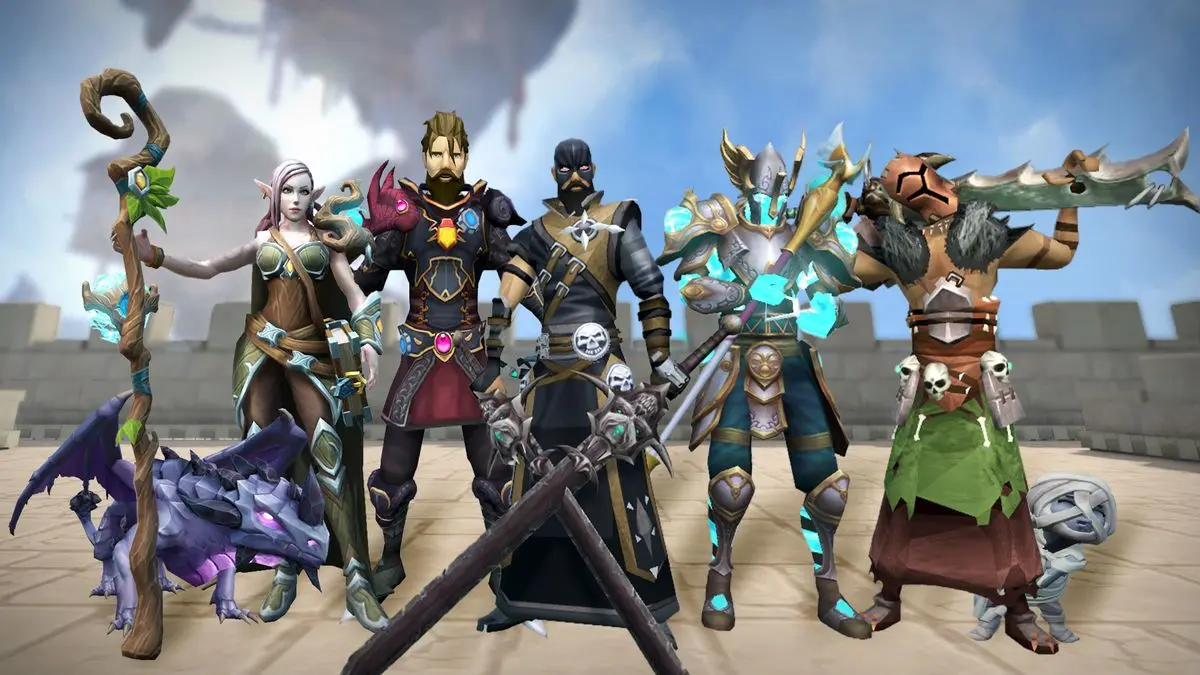
Runescape's latest content roadmap includes group ironman mode, a new skilling boss, and exciting advancements in woodcutting
Runescape, the game that isn't the old school one that I imagine when someone says "Runescape," just rolled out a new roadmap of upcoming content. On YouTube, Runescape developer Jagex unveiled Runescape Ahead, which it says will be its ongoing format for long-term previews of updates on the horizon. In the first instalment, detailing what'll be hitting Runescape through late 2024 and early 2025, Jagex offered early glimpses at a pile of new features, updates, and content additions, like new story quests and bosses, a group ironman mode, and more. Try to contain your excitement, woodcutters: You're getting a new tree.
Jagex will kick off its autumn updates with a new Underworld dungeon, where players will face a new skilling boss to enter the shrine of an absent goddess and earn new rewards. Later in autumn, alongside a new Halloween event called Harvest Hollow, Jagex is planning on bringing a group ironman mode to Runescape, where a team of players can face the game and earn unique cosmetic rewards using only what they can gather, craft, and loot amongst themselves—all without XP bonuses.
Throughout, Jagex will be implementing player-requested updates to skills. A fourth Necromancy conjure ability will arrive sometime in autumn, allowing players with sufficient skill to summon a phantom guardian. There'll also be a new Slayer monster to hunt, offering a Necromancy upgrade for the Slayer helm.
Winter will bring the first quest in an ongoing series, where players will return to the desert and take up their "unfinished business" with the goddess Amascut the Devourer. Around that time, Woodcutting and Fletching will get a 110 skilling update in line with the recent Mining and Smithing update, bringing a new tree to cut, a new hatchet to cut said tree with, and new level 100 and masterwork ranged weapons. Big disruptions in the wood space.
The Christmas Village event will return to close out the year with new quests, activities, and rewards, with more opportunities to get a Black Partyhat. Across early 2025, there'll be 110 skilling updates for Runecrafting and Crafting and an eventual across-the-board skilling overhaul to make skilling "competitively profitable" with combat loot. Along the way, a second and third quest will arrive for the new desert questline, culminating in a new boss fight with Amascut herself in mid-2025.
Source: PC GAMER
Read More...


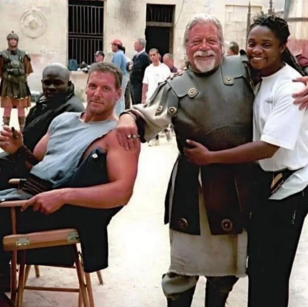
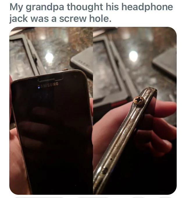
During the filming of Gladiator, Oliver Reed (Proximo) died in a bar after challenging a group of sailors to a drinking contest.
Reed consumed 8 pints of beer, 12 shots of rum, half a bottle of whisky, and shots of cognac This photo of him was taken shortly before he died.
#Gladiator #OliverReed #Interesting #Movie
Read More...


Vegans: We Only Eat Plants. Also Vegans: * EAT MUSHROOMS*
Vegans: We Only Eat Plants. Also Vegans: * EAT MUSHROOMS*
MUSHROOMS: I N JOKE FOR YOU?
#meme #fun #funny
Read More...


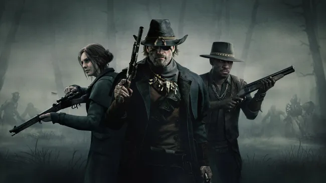
Hunt: Showdown enjoys highest-ever player count after 1896 update
Hunt: Showdown enjoys highest-ever player count after 1896 update, but player complaints about UI are pushing down its Steam review score: 'I've never seen such a bizarre reaction to so much amazing content'
Grungy horror extraction shooter Hunt: Showdown just received its biggest update in years, with developer Crytek upgrading its engine, overhauling its UI, adding a fourth map called Mammon's Gulch, and introducing other meaningful tweaks. It's such an extensive rework that the game has even been given a new name—Hunt: Showdown 1896.
The first day of availability saw Hunt reach a new high for concurrent players: 59,968, which is 18,000 more than its previous high in October 2023. Likewise, at the time we're publishing this, more than 51,000 are in-game, chasing and/or being immolated by the new Hellborn boss.
By that metric, the shooter is more popular than it's ever been. But simultaneously, the update has drawn aggravated complaints from a number of negative reviews on Steam, 3,730 of them so far, which have pushed Hunt's short-term label to Mostly Negative, while its longer-term state remains Mostly Positive.
How can Hunt both be more popular than ever and be condemned by a higher-than-ever number of players on Steam? The primary bone of contention is its new pre-match UI, shown in the video embedded lower on the page, with many reviewers complaining that Crytek's changes have made it worse rather than better.
The most common complaint about the UI is that it takes considerably more clicks to do most things in the menu than it did before. "Looks fancy but is a nightmare to navigate" says user Shinigaben. "You need 3 or so clicks per action more than the old UI and it also just gives way less information on one screen without switching between various submenus."
If you've lived through a UI update to a major social media platform like Facebook or Discord, you know that the shift to a new way of presenting information often sparks disproportionate fury. Some Hunt players are under the impression that this more complicated interface has been designed for console first, with players also lamenting the much larger icons and apparent lack of basic keyboard inputs. It's worth noting that Hunt was originally released on PC in 2018 (Early Access), with Xbox One and PS4 releases coming more than a year later, in 2019 and 2020. This new version, however, launches concurrently on PC, PS5 and Xbox Series X/S, so it is possible that the UI has been retooled with some compromises between those platforms.
Others accuse Crytek of redesigning the UI to push microtransactions to the forefront, with some comparing the new approach to the monetisation practices seen in games like Fortnite and Call of Duty: Warzone. "The first thing you see after loading ingame is them selling you skins!!!" writes user Asthmaschildkröte, with others saying that the UI pushes players to look at the Battle Pass. Personally, this doesn't resonate with us as longtime players of the game—Hunt's monetization is some of the least-burdensome and least prominent compared to its fellow service games.
It's worth noting that it isn't just the UI that's the object of players' ire. Some players claim that the update has introduced more performance problems than it solves. "With the update my performance has dropped to a level where I cannot play without stutters" says the evocatively named user Sloppy Steaks. Among these are a few complaints about bugs, and a handful of people claiming that the visuals have changed for the worse. These issues are far more sporadically raised than the problems with the UI, however, which seems to be mentioned in nearly every recent negative review left on Hunt's Steam page.
Anecdotally, playing the update last night, there were a couple of areas of the map where we noticed frame rates dropped (at one point our trio all noticed a drop of 10-20 fps, seemingly due to a visual effect that had triggered), but other than that our fps hasn't been significantly different than on last week's build.
It definitely seems like the UI has some problems that deserve some further consideration. But is the strength of the reaction justified? There are numerous reviews that praise the update generally, but ultimately deliver a thumbs down because of the UI. "New engine update has made the game itself much smoother for me. New map is really nice too. I like the increased verticality," says user Sir Fluffy McDuck. "HOWEVER, this new menu UI is such a pain." Furtive Pygmy, meanwhile, compliments Crytek on doing "a wonderful job with the update" but says the UI is "so bad that I simply do not wish to play anymore."
Can a menu UI (none of the complaints, to be clear, are focused on the in-match UI), be so bad that it truly ruins the experience of playing? Or is this another example of the PC gaming community disproportionately hyper-fixating on a facet of a game that they know will resonate in comment threads?
There are certainly some players who feel the latter is the case. "I've never seen such a bizarre reaction to so much amazing content," says Reddit user Redwood-Lynx, a "casual dad" player who praises the "incredible map" Crytek has added. "There has to be some kind of PC cultural quirk I'm just unaware of—being this aggrieved about MENUS is so beyond this old timers understanding. Did any of you actually play the game part? Does no one want to discuss the new weapons, the new boss, the new map, the new traits, the new balance changes, ANY OF IT? No, you just want to review bomb the greatest shooter of the last decade into oblivion because daddy gave your little console brother more attention."
As hinted at in the previous paragraph, this would not be the first time a game has struggled with misdirected anger from its community. Helldivers 2, perhaps the most mechanically ingenious shooter of the year, has been dominated by discourse over the balance of its weapons. Now, weapon balance can be crucial to the fundamental quality of a game. But Helldivers 2 is not an incredibly twitchy multiplayer shooter like Counter-Strike of Valorant, it's a cooperative PvE experience, a goofy Starship Troopers simulator with an emphasis on physics-based slapstick comedy. Balance is not really the point of Helldivers 2.
rom our hours playing Hunt's new update last night, the new UI, yes, does produce an amount of discomfort. Some years-worn habits now require more input—when you want to add several consumables to a character, you are pushed back and forth between the gear menu and the hunter details screen as you add each piece of equipment individually, which feels inefficient. A couple of actions are slightly smoother, like picking different life bar segments for your hunter. We can't dismiss that some players find the changes jarring, nonetheless, there is far more to the 1896 update than just the UI, and the manner in which those criticisms are being made does not paint a complete picture of the update's effect on the game.
Read More...
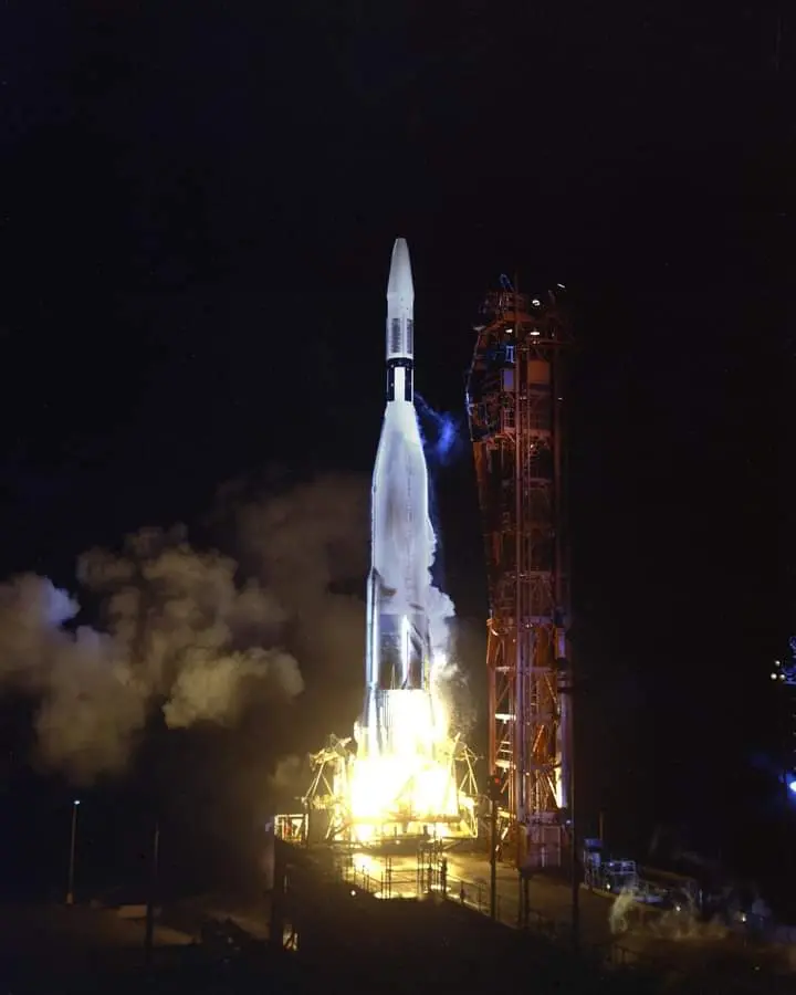
in 1961, Ranger 1, the first mission in the Ranger program, launched from Cape Canaveral Air Force Station.
#OTD in 1961, Ranger 1, the first mission in the Ranger program, launched from Cape Canaveral Air Force Station. A rocket malfunction during launch caused the spacecraft to get stranded in low-Earth orbit. Read More...